# Bootstrap
- Bootstrap is at this moment the most popular front-end (CSS) framework for building responsive, mobile-first websites
- You already master the Bootstrap grid for structuring your elements in a responsive way
- Bootstrap also offers a lot of easy to use components which immediately give your website a much more professional look and feel
- There is a lot of documentation available on the Bootstrap website (opens new window)
Bootstrap v5.x
- Bootstrap currently uses the
5.3.0-alpha1version on its website (opens new window)- We will use the latest sable version v5.2.x of Bootstrap in the course
- Pay attention to the version when Googling for Bootstrap-related information, as the differences between the major versions (v3.x.x, v4.x.x and v5.x.x) are significant!
# Getting started
- Getting started with Bootstrap on your website is quite straightforward
- Simply copy a CDN link to the (minified) Bootstrap CSS file and link to it in the
headpart of your HTML page(s):<link rel="stylesheet" href="https://cdn.jsdelivr.net/npm/bootstrap@5.2.3/dist/css/bootstrap.min.css"> <link rel="stylesheet" href="style.css">1
2- This file contains the whole Bootstrap framework, including bootstrap_reboot.css and bootstrap_grid.css
- Custom/extra styling can be done by using your own CSS file(s)
- Because of "cascading" they must always be linked AFTER the Bootstrap CDN link (otherwise it's possible that
Bootstrap will override your classes when they have the same name)
JQUERY: not required
Take note, as of version v5.x of Bootstrap, jQuery is not required anymore. However, we will still use it in this course as an additional, easy to use, JavaScript framework.
- Because of "cascading" they must always be linked AFTER the Bootstrap CDN link (otherwise it's possible that
Bootstrap will override your classes when they have the same name)
- Many Bootstrap components need JavaScript to function properly.
- Therefore, you also need to add the following
<script>tag to your HTML page(s), just before the closing</body>tag:<script src="https://cdn.jsdelivr.net/npm/bootstrap@5.2.3/dist/js/bootstrap.bundle.min.js"></script>1
- Simply copy a CDN link to the (minified) Bootstrap CSS file and link to it in the
REMARK: Which CDN?
- The CDN links above are the ones proposed on the Bootstrap quick start (opens new window) page
- Alternatively, Bootstrap can also be linked via other CDNs such as cdnjs (opens new window) (the CDN we already used before):
<head>
    ...
    <link rel="stylesheet" href="https://cdnjs.cloudflare.com/ajax/libs/bootstrap/5.2.3/css/bootstrap.min.css">
    <link rel="stylesheet" href="style.css">
    ...
</head>
<body>
    ....
    <script src="https://cdnjs.cloudflare.com/ajax/libs/bootstrap/5.2.3/js/bootstrap.bundle.min.js"></script>
</body>
1
2
3
4
5
6
7
8
9
10
TIP: Libraries and autocompletion in PhpStorm
- It is possible to make use of autocompletion for all the Bootstrap classes
- As we work with CDN links, we have to enable this feature manually
- Hover the Bootstrap CSS link and choose Download library (or
Alt+Shift+Enter)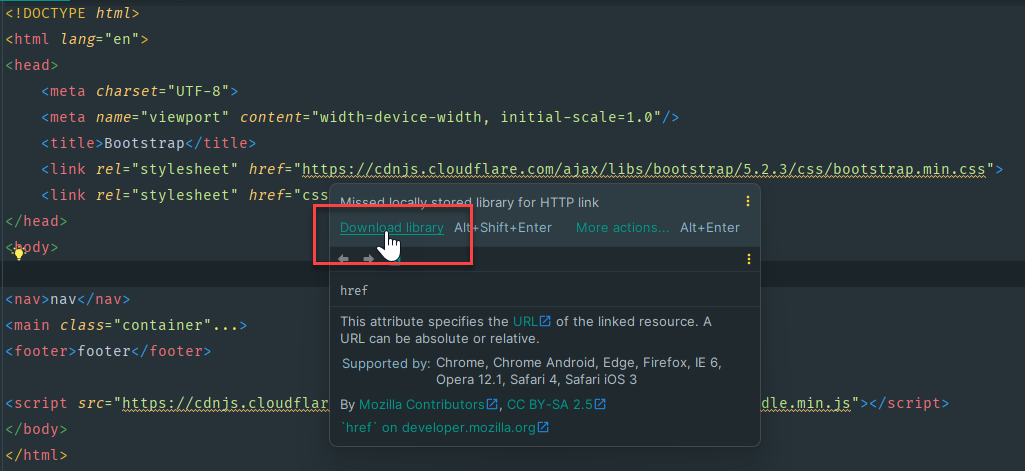
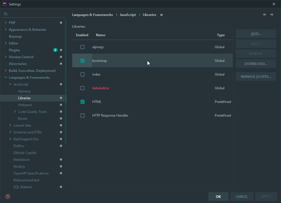
- You can enable/disable the downloaded libraries
via File > Settings > Languages & Frameworks > JavaScript > Libraries
- Hover the Bootstrap CSS link and choose Download library (or
- As we work with CDN links, we have to enable this feature manually
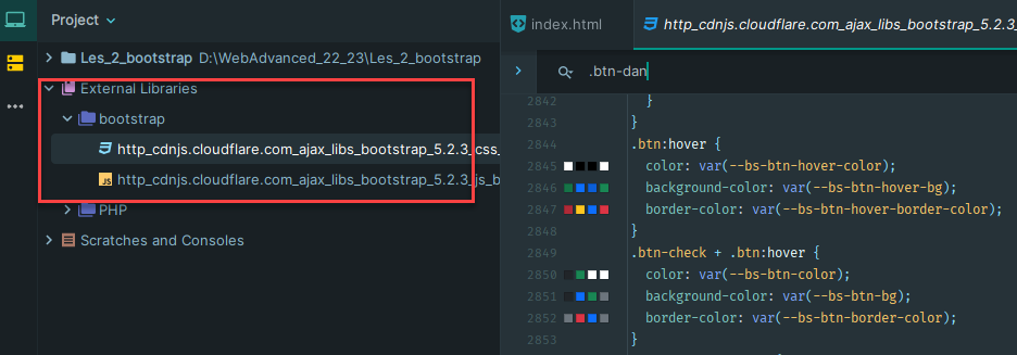
- The downloaded libraries can be consulted via External Libraries, in case you are interested in the code/implementation of a specific Bootstrap class
# Overview of Bootstrap documentation
# Layout
- Overview (opens new window)
- Containers and responsive breakpoints
- Grid (opens new window)
- Grid system based on twelve columns, five breakpoints and lots of predefined classes
- Utilities for layout (opens new window)
- Utility classes for showing, hiding, aligning, and spacing content
# Content
- Reboot (opens new window)
- A collection of some element-specific CSS changes in a single file, which makes each new webpage look the same (in any browser)
- Typography (opens new window)
- Global settings (default fontstack, font size, ...), headings, blockquotes, ...
- Images (opens new window)
- Responsive images, thumbnails, alignment, ...
- Tables (opens new window)
- Table head options, striped table, bordered/borderless table, responsive table, ...
- Figures (opens new window)
- Display related images and text with the
figurecomponent
- Display related images and text with the
# Components
- A component is a bundle of reusable HTML, CSS (and sometimes JavaScript) code for common elements, like Alerts (opens new window), Buttons (opens new window), Card (opens new window), Carousel (opens new window), Forms (opens new window), Modal (opens new window), Navbar (opens new window), Tooltips (opens new window), ...
# Utilities
- Bootstrap utility classes for Borders (opens new window), Colors (opens new window), Flex (opens new window), Spacing (opens new window) (margin & padding), Text (opens new window), ...
# Common use cases
REMARK
Below, we show some use cases of common Bootstrap components. Note that the corresponding Bootstrap classes cannot always be found directly in the code, as usually Bootstrap is only used as a foundation and the framework is altered to a greater or lesser extent (e.g. using Sass as we will show later on).
# Navbar
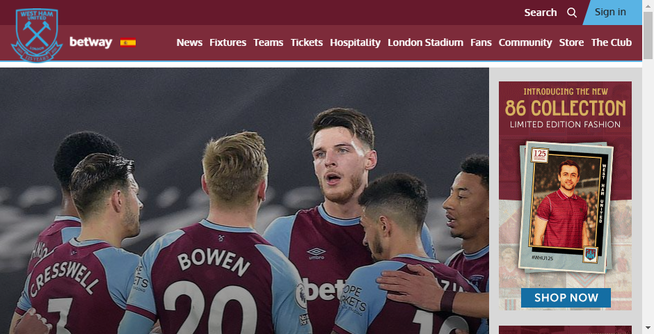
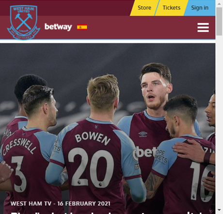
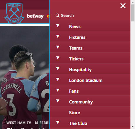
- A user-friendly Navbar (opens new window) is something you'll always need when building a responsive website, as it should be easy to access your navigation menu on all possible device sizes
# Cards
- Use Cards (opens new window) to show an overview of all the members of a team, products for sale, ...
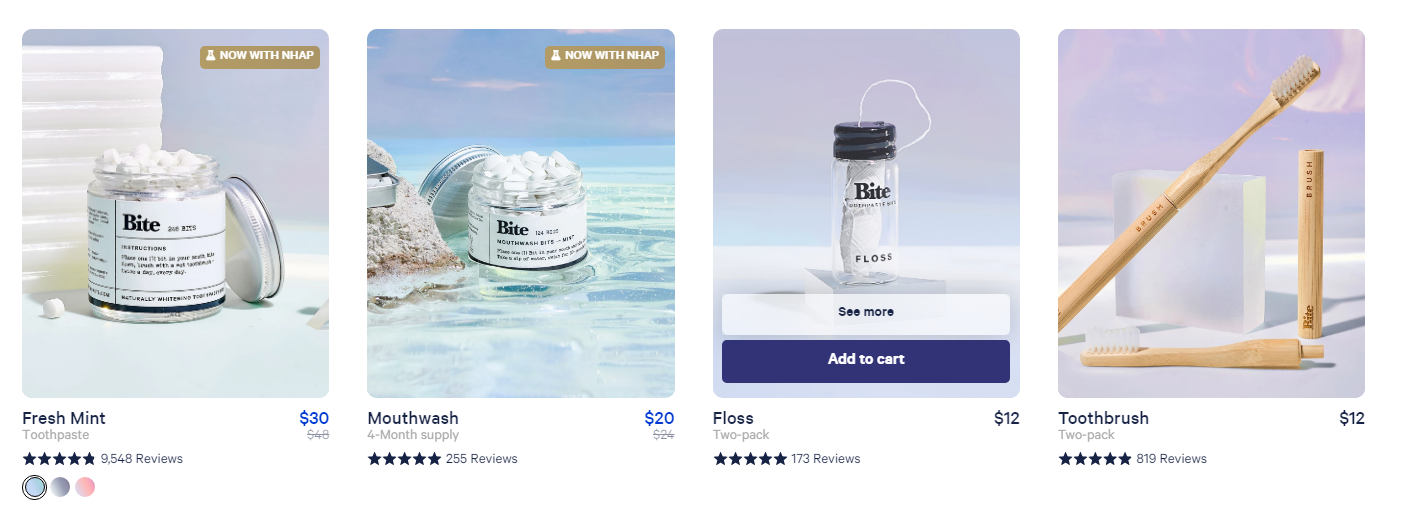
- Source: Bite (opens new window)
# Alerts and Forms
- Alerts (opens new window) are used to show feedback to the user after he/she performed an action, e.g. after submitting Forms (opens new window)
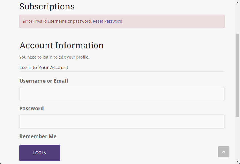
- Source: Colorlib (opens new window)
# Digging deeper
# Bootstrap version 5 course
- W3Schools has a very nice interactive course (opens new window) on Bootstrap v5.
- Here (opens new window) you can also find an interesting tutorial
- Bootstrap courses on YouTube (opens new window)