# Exercises
REMARK
- Start with downloading sass-exercises.zip, in which all the starting files of the Sass exercises are bundled
- The folder structure of these exercises is similar to the structure used for the examples: the (main) Sass file scss/style.scss should be compiled to dist/css/style.css, as the latter is the CSS file which is linked to in the HTML page dist/index.html
- We also included a package.json file with some (npm) script definitions in it, so that you can use
the
npm run <name-script>commands to start live-server and the Sass compilations for the respective exercises
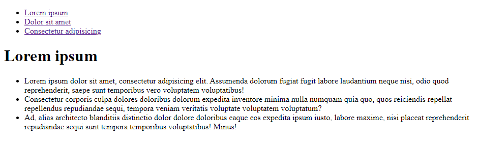
# Exercise 1
- Topics involved: variables, functions and nesting
- Study the code in exercise1/dist/index.html, which results in the following output (without any styling):
- Write SCSS code in exercise1/scss/style.scss to achieve the following result:
- Instructions:
- Declare (and use) a variable
$fontstackand store the imported Google font'Gotu'in this variable - Declare (and use) a variable
$fontsizewith value16px - Declare a variable
$primarywith valuelightskyblue. Use a Sass function to darken this color and save the result in the variable$primary_dark- Later on, you can change this color to another "light" color, e.g.
lightpink(0:27 in solution video) oraquamarine(0:37 in solution video) and your whole page (including the navbar) will be "re-colored"
- Later on, you can change this color to another "light" color, e.g.
- Add a universal reset, apply a standard
line-heightand add some paddings where needed - The
#containershould be centered horizontally and has a maximum width of800px - The text
colorof the major headingh1is$primary-dark - Use the flexbox technique to transform the unordered list in the
navelement to a full-blown navbar- Use nesting (so that the other list in the document is not affected)
- The
background-colorof the items equals$primary, while theoutline(gives better results thanborder) and link texts are shown in$primary-dark - When hovering over a menu-item, the link is made
boldand the colors (colorandbackground-color) are switched in atransitionof1s - For small screens, the menu-items are placed beneath each other. From screen widths of
650pxor larger, the menu-items are placed besides each other
- Adjust the left margin of the unordered list in the
mainelement (so that the bullets are horizontally aligned with the rest of the document)
- Declare (and use) a variable
# Exercise 2
- Topics involved: variables, functions and mixins
- Study the code in exercise2/dist/index.html, which results in the following output (without any styling):
- Write SCSS code in exercise2/scss/style.scss to achieve the following result:
- Extra small (< 576px) screen:
- Small (< 768px) screen:
- Medium (>= 768px) screen or larger:
- Extra small (< 576px) screen:
- Instructions:
- Declare 2 variables
$small(with value576px) and$medium(with value768px) - Write a mixin
layoutwith 2 arguments$colorand$size(with default value14px), which sets- the (text)
colorto$color - the
background-colorto the inverted color of$color, but with an adjusted$lightnessof20% - the
font-size,marginandpaddingequal to$size - the
line-heightequal to1.5(or$size*1.5) - a solid
borderof5pxin color$color
- the (text)
- Add a universal reset and some paddings where needed
- Use
Verdana(with a suitable fallback font) - Use the mixin
layoutto give#containera layout based ondarkred(and the default$sizeof14px) - On small screens, the layout should be based on
darkblueand16px - On medium screens (or larger), the layout should be based on
darkgreenand20px
- Declare 2 variables
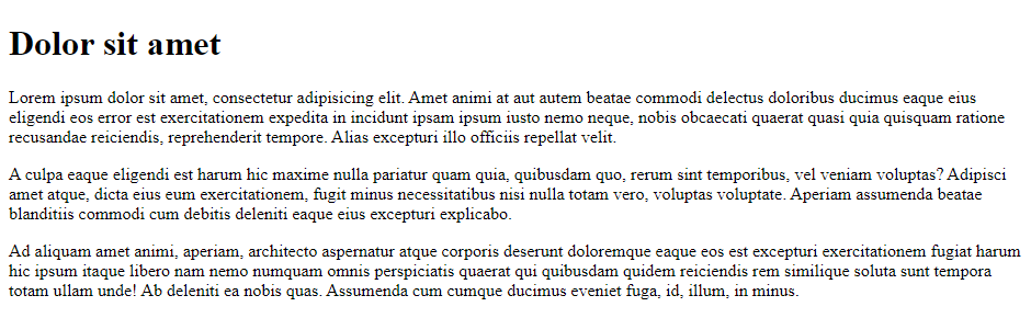
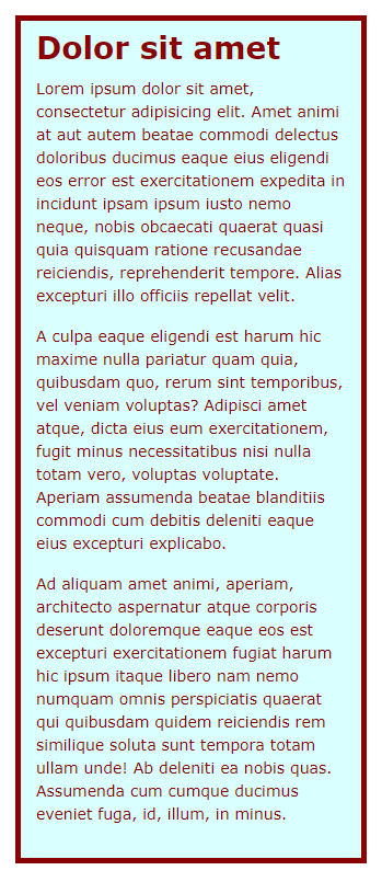
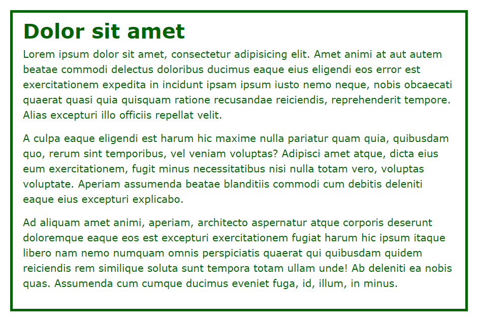
# Exercise 3
- Topics involved: variables, functions, nesting, mixins and partials
- Study the code in exercise3/dist/index.html, which results in the following output (without any styling):
- Write SCSS code in exercise3/scss to achieve the following result:
- Instructions:
- Make 3 new partials: _variables.scss, _mixins.scss and _reboot.scss
- In your main file style.scss, you import the Google font 'Anton' and these 3 partials (in the correct order)
- _variables.scss
- Declare 3 variables
$fontstack-titles('Anton'with a suitable fallback font) ,$fontstack-text(Verdanawith fallback font) and$small(600px)
- Declare 3 variables
- _mixins.scss
- Copy the mixin
layout(from Exercise 2) to this file
- Copy the mixin
- _reboot.scss
- Add a universal reset
body:- font:
$fontstack-text - layout based on
whiteand1remfor extra small screens (< 600px) - layout based on
blackand1.25remfor small screens or larger (>= 600px)
- font:
- main heading:
- font:
$fontstack-titleswith size1.75rem - some padding at the bottom
- font:
- paragraphs (in
article)- some padding at the bottom
- links in all states:
- block elements with a
widthof130px - font:
$fontstack-titles - layout based on
blackand1rem(remove the margin on the left!)
- block elements with a
- links when hovered:
- layout based on
dimgrayand1rem
- layout based on
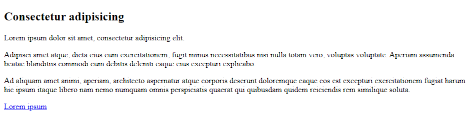
# Exercise 4
- Topics involved: nesting, mixins and partials
- Study the code in exercise4/dist/index.html, which results in the following output (without any styling):
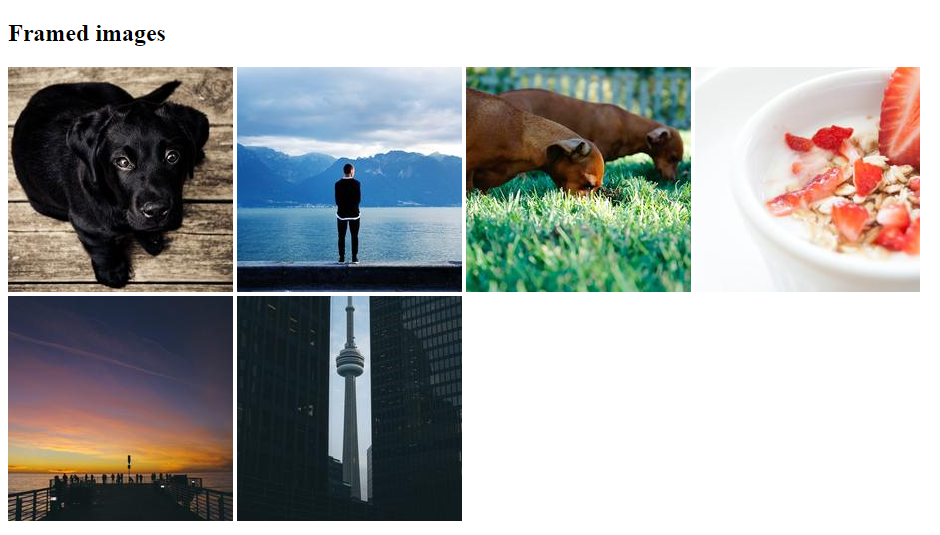
- Write SCSS code in exercise4/scss to achieve the following result:
- Instructions:
- Make 2 new partials: _mixins.scss and _reboot.scss
- In your main file style.scss, you import these 2 partials (in the correct order)
- _mixins.scss
- Write a mixin
framewith 6 parameters$thickness: thickness of the border$style: style of the border (default =solid)$color-border: border color (default =#OOO)$color-bg:background-color(default =#eee)$padding: space on the inside of the element (default =10px)$radius: rounding applied to the element (default =15px)- and, when hovering: a
box-shadowin0.75opaque black,5pxto the right and the bottom, with a blur of10px
- Write a mixin
- _reboot.scss
- Add a universal reset and some padding below the main heading
body:- font:
Genevawith a suitable fallback font blacktext on gray (#ccc) background
- font:
article:- maximum width of
800px, centered - white (
#fff) background - centered content
- maximum width of
section- Use flexbox to display the images next to each other (with equal space between them), and on multiple lines when needed
img(insection)widthandheightequal to225px- some
marginat the bottom - Add some layout using the mixin
frame:- 1st image: border thickness
3px, no other parameters specified - 2nd image: border thickness
3px, border styledotted, no other parameters specified - 3rd image: border thickness
3px, border stylesolid, border colormediumseagreen, no other parameters specified - 4th image: border thickness
6px, border stylesolid, border color#b8181b, background#e7d5c2,20pxspace on the inside androundingof40px - 5th image: border thickness
6px, border styledashed, border colorrgb(109,85,106),perubackground,20pxspace on the inside and rounding of50% - 6th image: border thickness
3px, background#aac5d9,20pxspace on the inside and rounding of50%, no other parameters specifiedTIP
Use the
nth-child()(pseudo-class) selector to identify the different images
- 1st image: border thickness
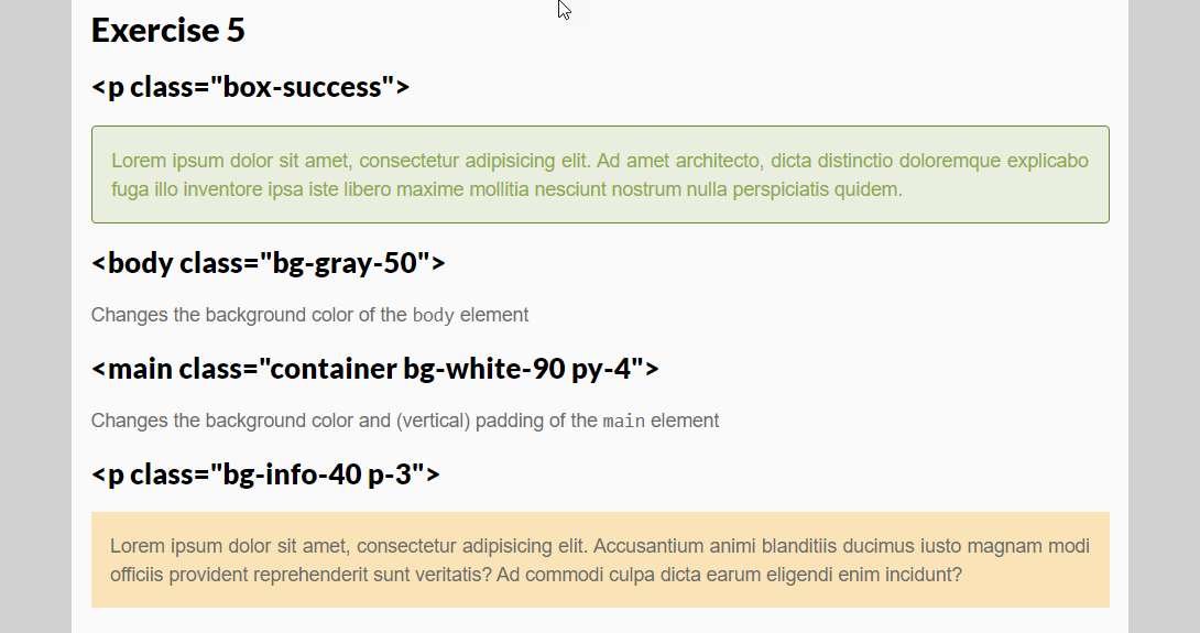
# Exercise 5
- Topics involved: variables, functions, mixins, partials and advanced topics
- In this exercise, you start from the source code of TMF (see Example 2)
- In index.html, we already added
- some new classes to the
bodyandmainelement - extra paragraphs with some new classes assigned to it
- some new classes to the
<body class="bg-gray-50">
<main class="container bg-white-90 py-4">
...
<h2>Exercise 5</h2>
<h3><p class="box-success"></h3>
<p class="box-success">Lorem ipsum dolor sit amet, consectetur adipisicing elit. Ad amet architecto, dicta
distinctio doloremque explicabo fuga illo inventore ipsa iste libero maxime mollitia nesciunt nostrum nulla
perspiciatis quidem.</p>
<h3><body class="bg-gray-50"></h3>
<p>Changes the background color of the <code>body</code> element</p>
<h3><main class="container bg-white-90 py-4"></h3>
<p>Changes the background color and (vertical) padding of the <code>main</code> element</p>
<h3><p class="bg-info-40 p-3"></h3>
<p class="bg-info-40 p-3">Lorem ipsum dolor sit amet, consectetur adipisicing elit. Accusantium animi
blanditiis ducimus iusto magnam modi officiis provident reprehenderit sunt veritatis? Ad commodi culpa
earum eligendi enim incidunt?</p>
</main>
</body>
1
2
3
4
5
6
7
8
9
10
11
12
13
14
15
16
17
18
19
20
21
22
23
2
3
4
5
6
7
8
9
10
11
12
13
14
15
16
17
18
19
20
21
22
23
- It's up to you to write the Sass code that will generate these new classes such that the index page looks as follows:

- Instructions:
.box-primary,.box-danger, ...- Add a new partial helpers/_box.scss
- Use an
@eachrule to define the classes.box-primary,.box-danger, ... which change an element into a "box" with colors based on the colors defined in$color-map- The text
colorequals the specified color - The
background-colorequals the specified color, but with an alpha value of0.15 - Add a solid,
1pxborderin the specified color, but with an adjusted$lightnessof-10% - Add a
paddingandmargin-bottomof1rem - Add a
border-radiusof0.25rem
- The text
- Afterwards, try moving the "box code" to a mixin
color-boxin mixins/_colorbox.scss- Import this new partial mixins/_colorbox.scss at the correct place in style.scss
- The mixin
color-boxshould have (at least) one parameter for the$color(but you might add different parameters as well)
.bg-primary-50,.bg-danger-90, ...- Add a new partial helpers/_background.scss
- Use a nested iteration (
@forwithin@eachor vice versa) to generate the classes.bg-primary-X,.bg-danger-X, ... withXequal to0,10,20, ...,100- The
background-colorshould be set to the specified color, with an alpha value ofX/100
- The
- Classes for padding (
.p-3,.pt-5, ...) and margin (.mx-2,ml-0, ...)- Add a new partial helpers/_spacing.scss
- Use a
@forrule to define the padding classes.p-X,.px-X,.py-X,.pt-X,.pr-X,.pb-Xand.pl-Xto add (overall, horizontal, vertical, top, right, bottom and left) padding- The value of
Xranges from0to5(included!) resulting in a padding value ofX/3rem
- The value of
- Similarly, generate also the corresponding (overall, horizontal, vertical, top, right, bottom and left) margin classes
.m-X,.mx-X,.my-X,.mt-X,.mr-X,.mb-Xand.ml-X