# Exercise
- The goal of this exercise is to create a website to order food from a pop-up snackbar
- Start from html-css-exercise.zip, which contains two basic, unstyled HTML files (index.html and order.html) and three images (pizza.jpg, salad.jpg, sandwich.jpg) in the folder images
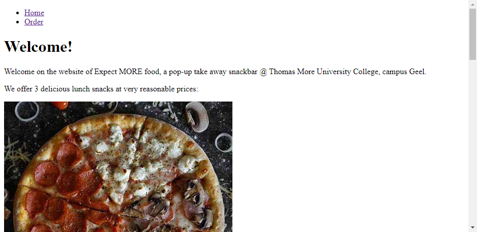
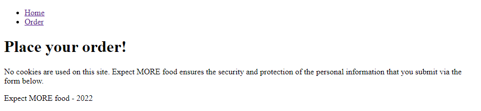
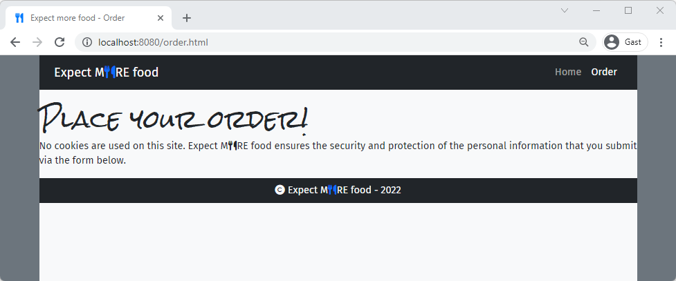
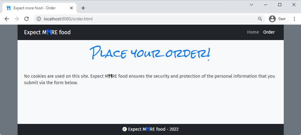
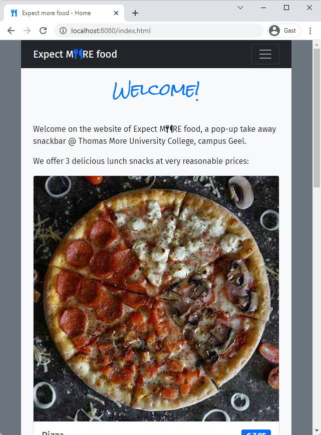
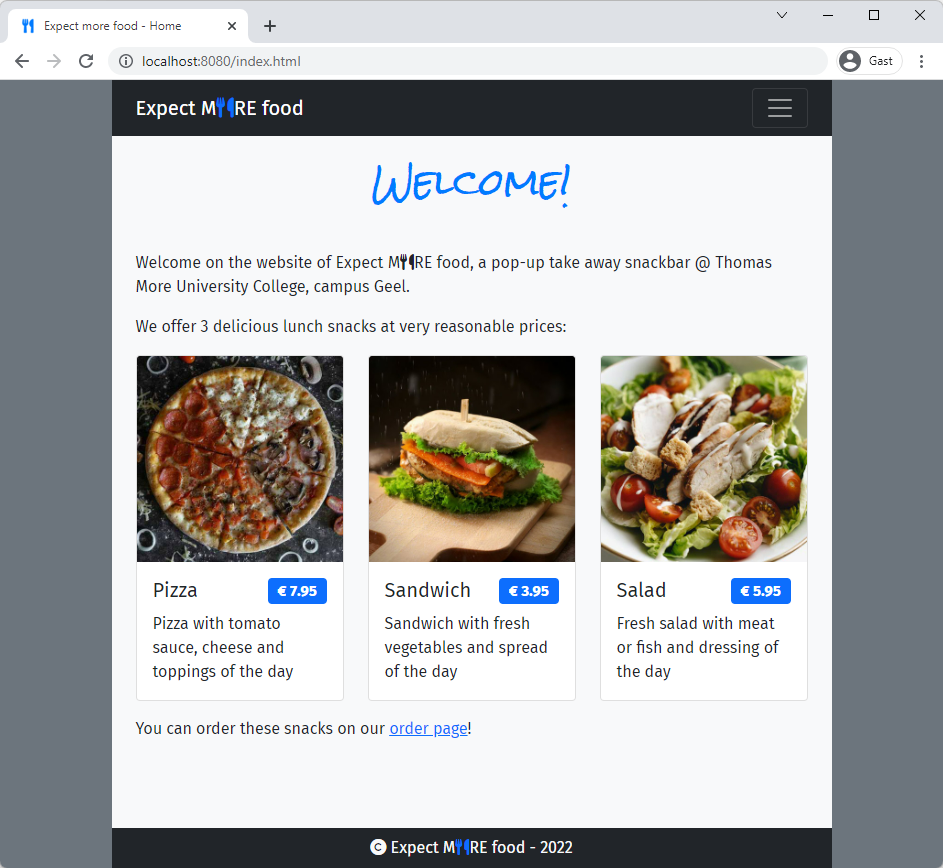
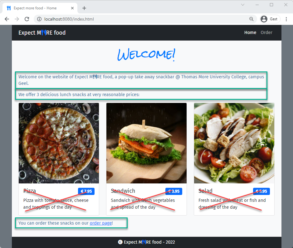
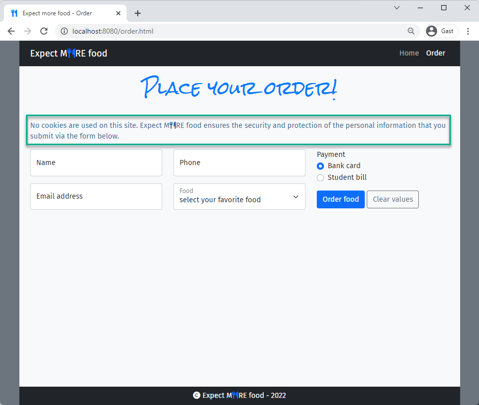
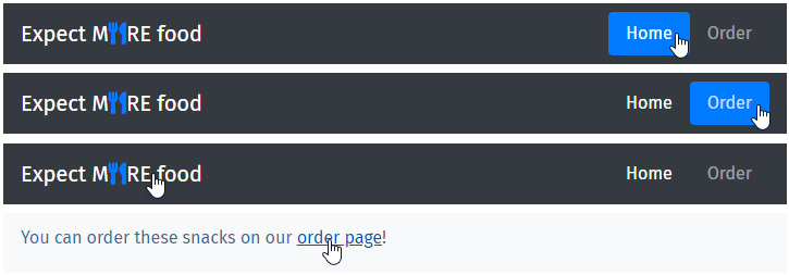
- This is what the solution should look like:
- The exercise is divided in 3 parts. Each part requires the knowledge of specific HTML/CSS topics, as stated in the prerequisites remarks
# Part 1 - Preparation
PREREQUISITES
- Favicon Generator
- Web fonts & Icons
# Favicon
- Create a folder icons
- Download the following SVG and use it to create all the favicons using RealFaviconGenerator (opens new window)

- The icons must be placed in the icons folder (make sure to apply the correct path options BEFORE generating the icons)!
- Add the generated icon code to (the
headsection in) both pages index.html and order.html
# Google Fonts
- Create a new CSS file style.css (in a subfolder css) and link it to both HTML pages
- Import the 'Fira Sans' (styles: 'Regular 400' and 'Bold 700') and 'Rock Salt' Google fonts (opens new window)
- Apply
'Fira Sans'to thebody, while'Rock Salt'is used for the main headingsh1
- Apply
# Font Awesome icons
- Import a Font Awesome 6 CDN link in style.css
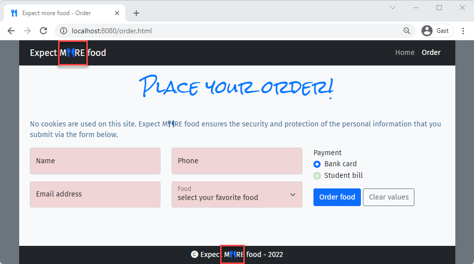
- Add the
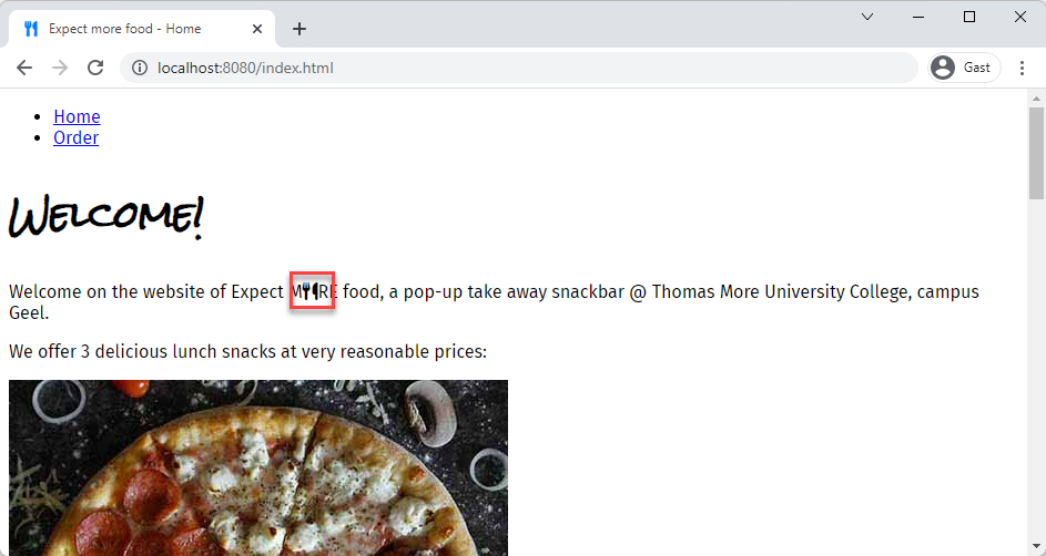
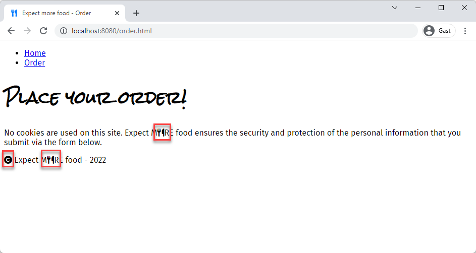
fa-copyrighticon in front of 'Expect MORE food' in thefooter(of both HTML files) - Replace the O in 'Expect MORE food' by the
fa-utensilsicon in the first paragraph and in thefooter(of both HTML files)
# Part 2 - Adding and styling content
PREREQUISITES
- Bootstrap 5 grid and utilities
- Bootstrap 5 forms
TIPS
- Use the Bootstrap documentation (opens new window) to look for specific code examples, class names, ...
- Try to get an understanding of the different Bootstrap classes by examining the corresponding code (either via developer tools/
F12or via the source code)
# Both pages
- Copy the necessary Bootstrap CDN links (CSS and Javascript!) to both HTML files
- Be sure to link the Bootstrap CSS BEFORE your own style sheet style.css
- Give the body a
secondarybackground color - Put all the content (
nav,mainandfooterelements) in acontainerwithlightbackground color- no horizontal padding
- a minimum height of
100vh - a column-based flex display
# Navigation
- Change the
navinto a responsivenavbarwithdarkbackground andlighttext- The
navbarcontent collapses behind a hamburger icon (on small screens) and expands onmdand larger screens - The
navbar-brandat the left of thenavbarcontains the iconfa-utensilsin colorprimary - Add some horizontal padding
- The
- Make sure that the
activeclass is added to the link that corresponds to the current page!
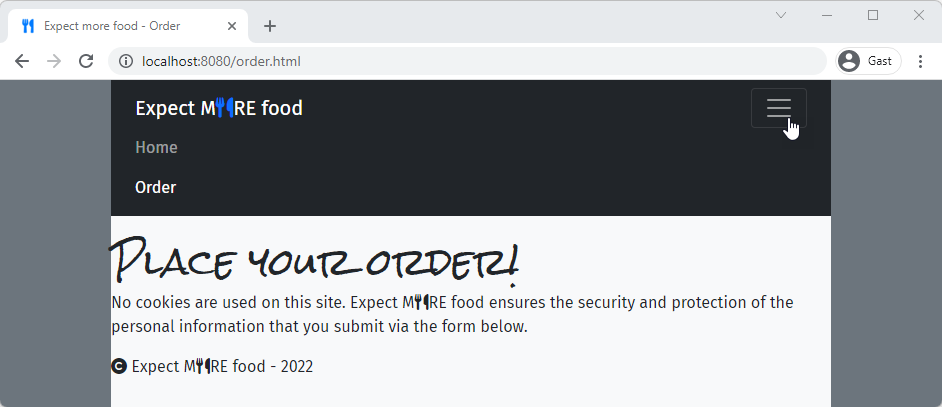
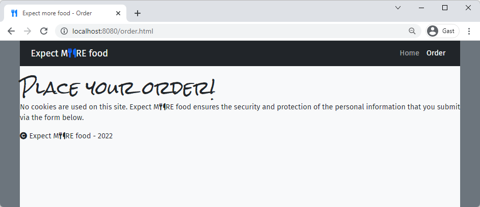
# Footer
- Give the
footeradarkbackground andlighttext color - Center the text (horizontally and vertically) in the
footerand add some padding/margin to te elements - Change the color of the
fa-utensilsicon toprimary
# main element
- Add some horizontal padding to the
mainelement, which should fill the remaining space in the flex container (resulting in afooterthat sticks to the bottom of the page) - The main heading
h1should be centered, has some bottom padding and colorprimary
REMARKS
- As a lot of code (
nav,footer, layout ofmainandh1element) is completely/nearly the same on both pages, you probably copied it from one file to the other. Unfortunately, this approach is not that maintenance-friendly, as changes to the common layout need to be applied on both (all) pages. - Solutions/alternatives:
- For now, you could opt to transfer some common styling to css/style.css, e.g. for
h1However, it will be infeasible/unpractical to code the more complex styling/functionality (e.g. related to theh1 { ... text-align: center; padding-bottom: 3rem; color: #007bff; }1
2
3
4
5
6navbar) yourself. And what's the point of using a framework like Bootstrap if you're going to (re)write everything yourself anyway? - A better solution/alternative will be discussed in our Course 'Web Applications in PHP' (2 ITF) (opens new window)
- In PHP you can store the common code in separate files which then can be included in your specific pages
- In Laravel (a PHP framework) you can make a template (with the common code in it), which then can be extended and adjusted for the specific pages
- For now, you could opt to transfer some common styling to css/style.css, e.g. for
# index.html
- Use Bootstrap
cards to organize the information of the three lunch snackscard-img-topfor the imagecard-bodycard-titleforh5- The price should be included in a
badgewithprimarybackground color, which should be right-aligned
(Tip: make theh5a flex container)
- The price should be included in a
- snack description in
card-text
- On small devices, the cards should take the full width of the container. For
md(and larger) screens, the cards are placed besides each other.
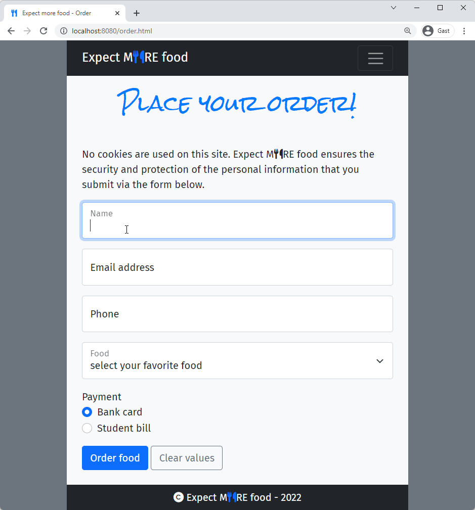
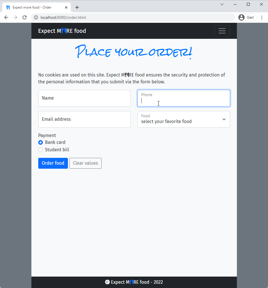
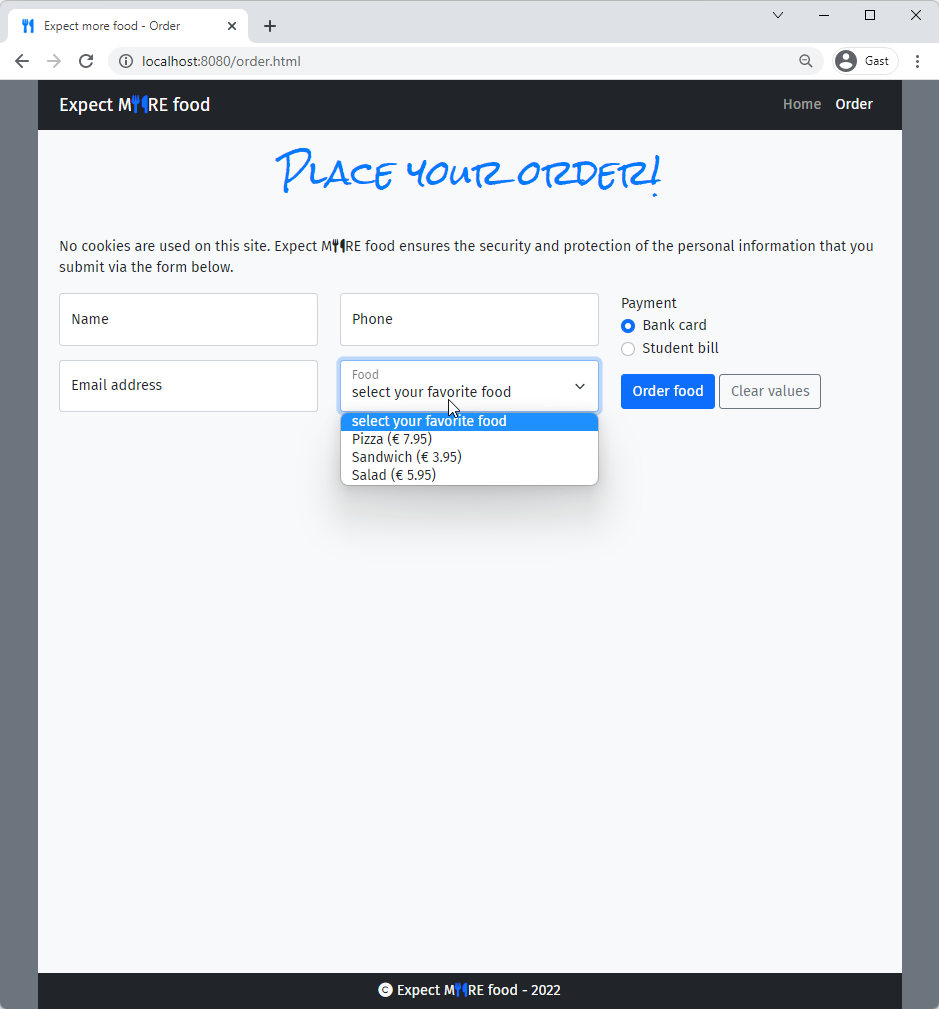
# order.html
- Complete the
form- Use the
postmethod and submit the form tohttps://it-fact.be/form.php - Floating
labelandinput(text) for 'Name',required - Floating
labelandinput(email) for 'Email',required - Floating
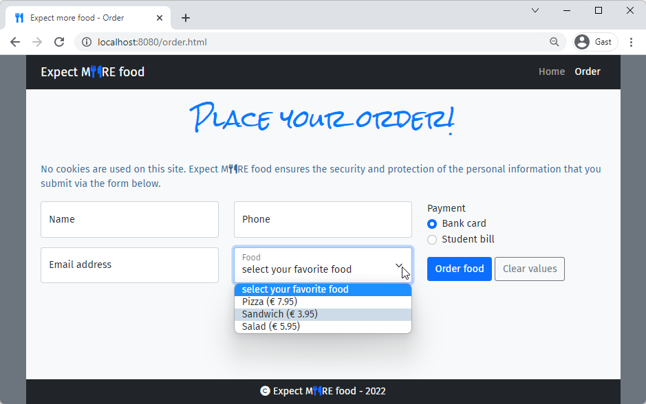
labelandinput(tel) for 'Phone',required,patternfor Belgian (landline and mobile) numbers - Floating
labeland dropdown list for 'Food' with values 'Pizza (€ 7.95)', 'Sandwich (€ 3.95)' and 'Salad (€ 5.95)' label'Payment'labels andradiobuttons for 'Bank card' and 'Student bill'
- two
buttons placed besides each other, with some extra margin above/below thembuttoninprimarycolor to submit the formbuttonwithsecondaryoutline that clears the values (back to default values)
- Use the
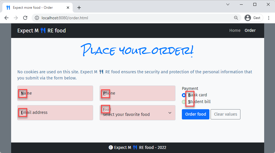
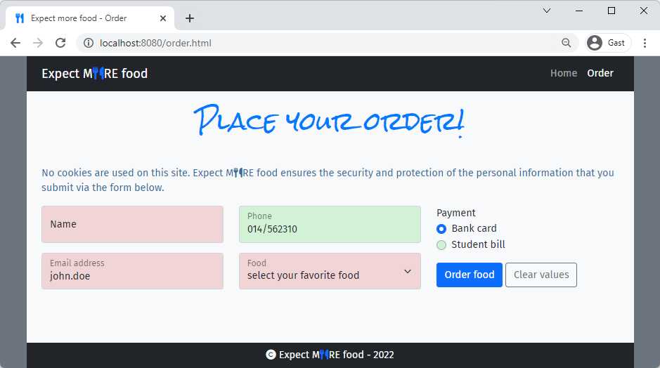
- Use the information on the following screenshot to determine the
nameattributes you should use:
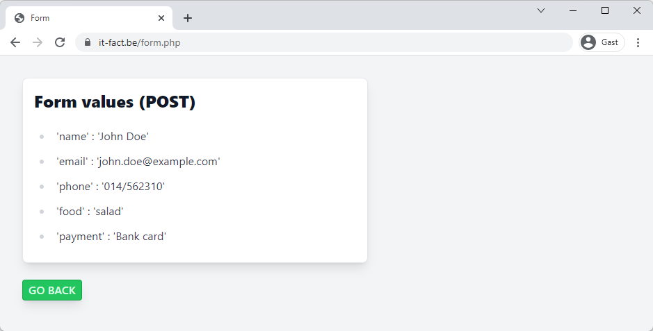
- The
formshould look different depending on the screen size
TIP
As this implementation with 3 designs (2 breakpoints) for the form is rather challenging, you might start with 2 designs (1 breakpoint) and leave out the design for lg (or larger) devices at first
# Part 3 - The finishing touch
PREREQUISITES
- CSS Selectors in
style.css
- Use a general sibling selector to give all paragraphs (preceded by and on the same level as a
h1) a blue-ish
(rgb(50, 110, 160)) text color
- Use a pseudo-class selector to give the options (in the dropdown list) a "striped" look and feel using the color
rgba(50, 110, 160, 0.25)
- Use a pseudo-class selector to give the invalid input and select fields a red-ish (
rgba(200, 0, 0, 0.15)) background
Use a pseudo-class selector to give the valid input and select fields a green-ish (rgba(0, 200, 0, 0.15)) background
- Use a pseudo-class selector to give the links (in the
navbar) aprimary(=#007bff) background with0.25remradius- The
navbar-brandlink and other links on the pages should not be affected!
- The
- Use an attribute selector to select all the
fa-utensilsicon and add0.5remleft and right margin to them - Use an attribute selector combined with a psuedo-class selector to underline the first letter of all labels with a
forattribute, and make these letters bold and underline